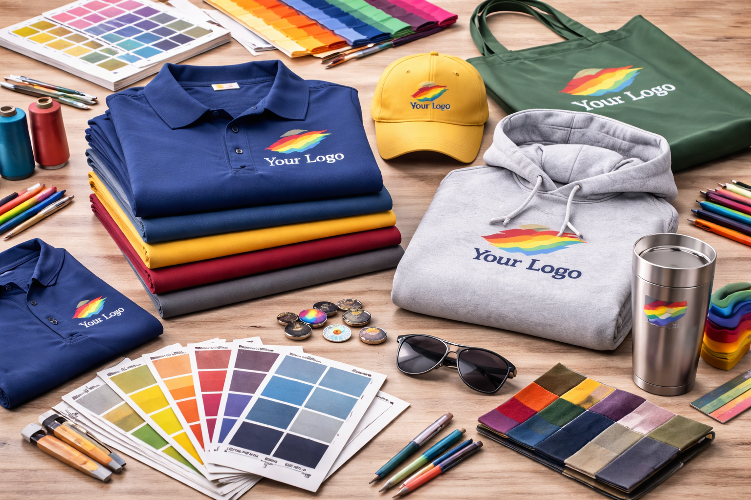
Color plays a bigger role in branding than many people realize. It affects visibility, readability, style, and even how people feel about the item they receive. When you’re ordering custom apparel or promotional products, choosing the right colors can make the difference between something people use often and something they forget about.
Here’s how to make smarter color choices for your next custom order. Those decisions also play directly into how custom apparel builds brand recognition over time, especially when the same colors show up consistently across your apparel and promo pieces.
Start With Your Brand Colors
The first place to begin is your existing brand identity.
If your business already has:
-
logo colors
-
brand guidelines
-
preferred color combinations
those should usually guide your apparel and product choices.
That said, not every brand color works equally well on every material. A color that looks strong on a website may look very different on fabric, thread, or a physical product surface.
The goal is not always exact duplication — it’s strong, recognizable representation.
Think About Contrast First
One of the biggest mistakes in custom apparel is choosing colors that don’t contrast well enough.
Examples of common issues:
-
dark logos on dark garments
-
light thread on light fabric
-
low-contrast print colors that disappear from a distance
If people can’t clearly see your logo, the design loses impact no matter how nice the garment is. That is one reason it helps to review what makes a custom apparel order print-ready before you finalize art, garment color, and decoration choices.
Good contrast helps with:
-
readability
-
visibility
-
cleaner presentation
-
stronger brand recognition
Match Color Choice to the Purpose
The right color depends a lot on how the item will be used.
For example:
-
Employee apparel often works best in clean, professional, versatile colors like navy, black, gray, or muted tones.
-
Event apparel can support brighter, more energetic colors that stand out in crowds and photos.
-
Promotional products may benefit from colors that feel fun, practical, or highly visible depending on the audience.
A good color choice should support the item’s job, not just look attractive by itself. That same distinction is why employee apparel vs. event apparel should never be treated like the same project.
Consider Wearability
The best custom apparel is apparel people actually want to wear.
That means thinking about what colors feel:
-
easy to match
-
flattering
-
practical
-
reusable in everyday life
Neutral colors like black, navy, heather gray, and white tend to stay in rotation longer because they’re easy to wear repeatedly. That is closely tied to how to choose custom apparel your team will actually wear instead of apparel that ends up unused.
Bright or bold colors can be effective, but they work best when the situation calls for energy and visibility.
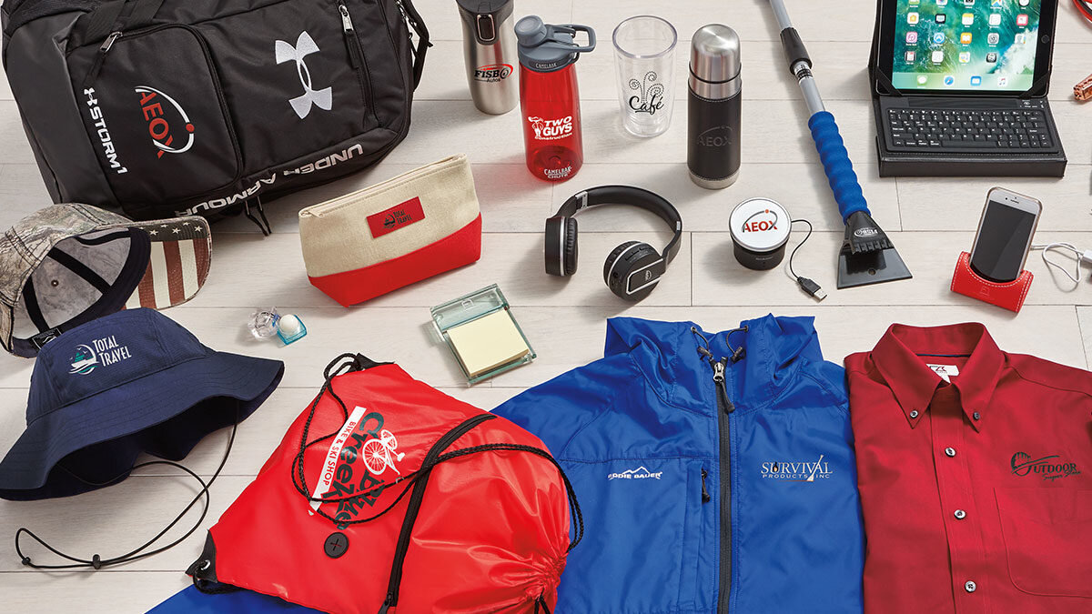
Fabric and Product Materials Affect Color
Color doesn’t behave the same way across all surfaces.
A logo may appear different on:
-
cotton
-
polyester
-
fleece
-
hats
-
bags
-
drinkware
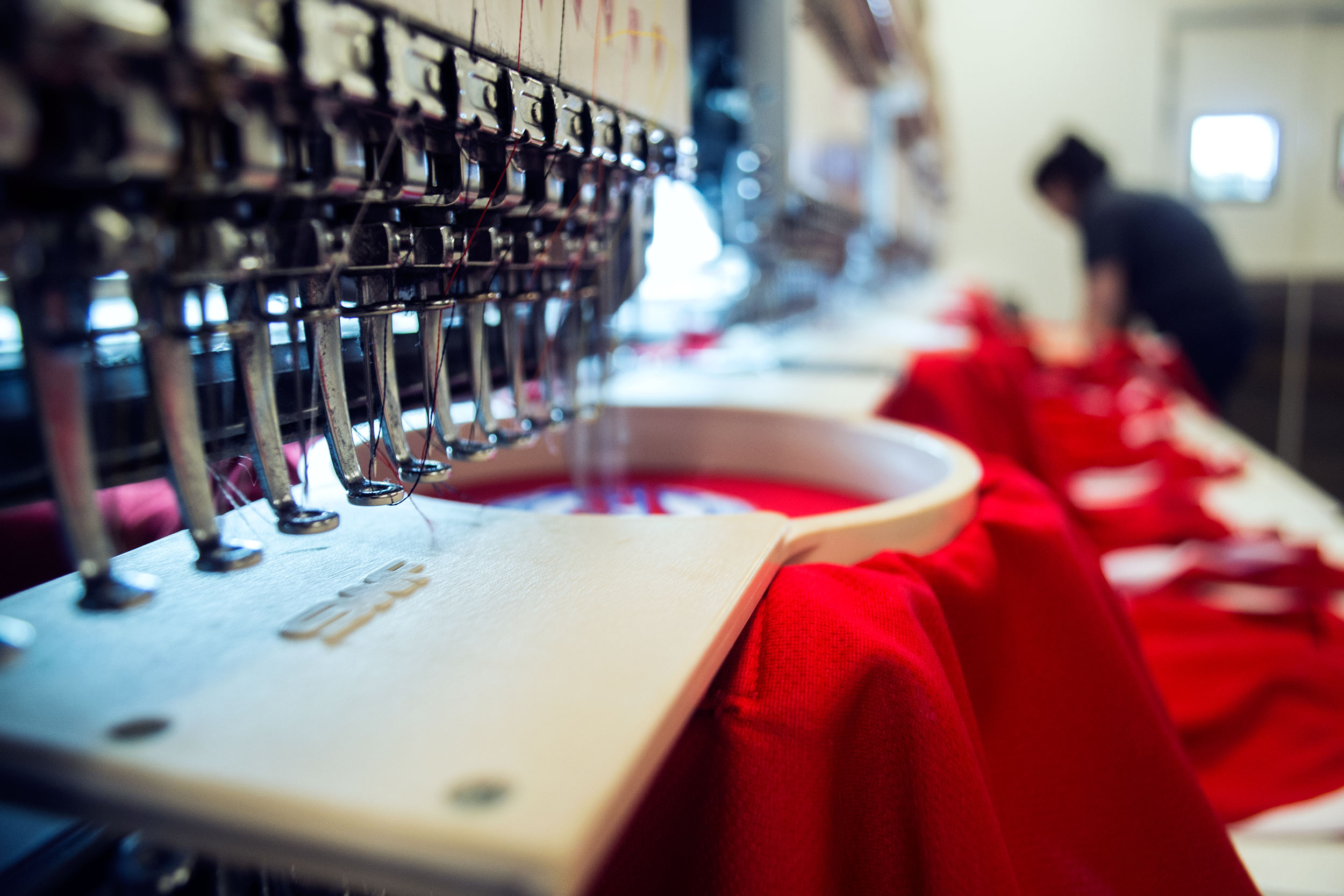
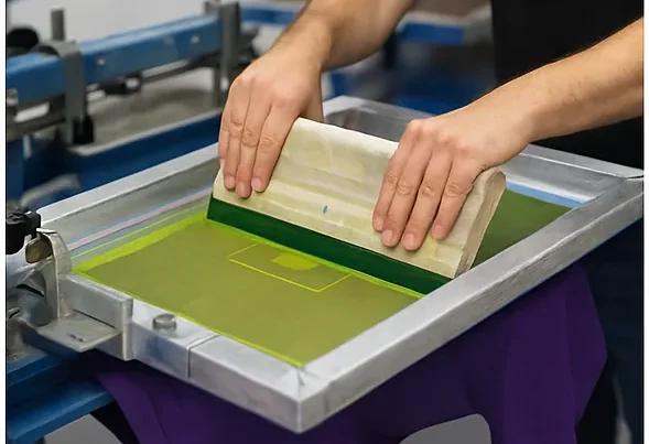
Thread colors in embroidery can also look slightly different than ink colors in screen printing. Product materials may reflect light differently, which changes how a color feels in person.
That’s why mockups and physical samples can be so helpful when consistency matters.
Seasonality Can Help Guide Color Decisions
Color can also support timing.
For example:
-
spring events often work well with lighter, fresher tones
-
fall apparel often leans into darker, warmer shades
-
holiday promotions may use more seasonal palettes
-
employee uniforms often benefit from year-round versatility
You don’t always need seasonal colors, but they can strengthen the overall feel of a campaign or event.
Keep the Audience in Mind
Not every audience responds to color the same way.
Think about:
-
who will be wearing the apparel
-
who will be receiving the products
-
whether the item is meant to feel premium, casual, fun, or professional
A corporate client gift may call for understated, refined tones.
A school or fundraiser order might benefit from bold, spirited color choices.
The better the color matches the audience, the more likely the item is to be used and appreciated.
When in Doubt, Keep It Simple
Sometimes the best choice is the simplest one.
A clean garment color with a well-contrasted logo often performs better than an overcomplicated combination. Simplicity tends to age better, wear better, and fit more situations.
If you’re unsure, starting with:
-
one strong garment color
-
one clear logo treatment
-
one practical use case
is usually a smart move.
Final Thoughts
Choosing the right colors for custom apparel and promotional products is about more than aesthetics. It’s about visibility, comfort, usability, and brand consistency. When color choices are made intentionally, the final product feels more professional, more wearable, and more effective.
The best colors don’t just look good — they help your brand work harder.