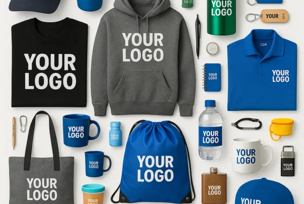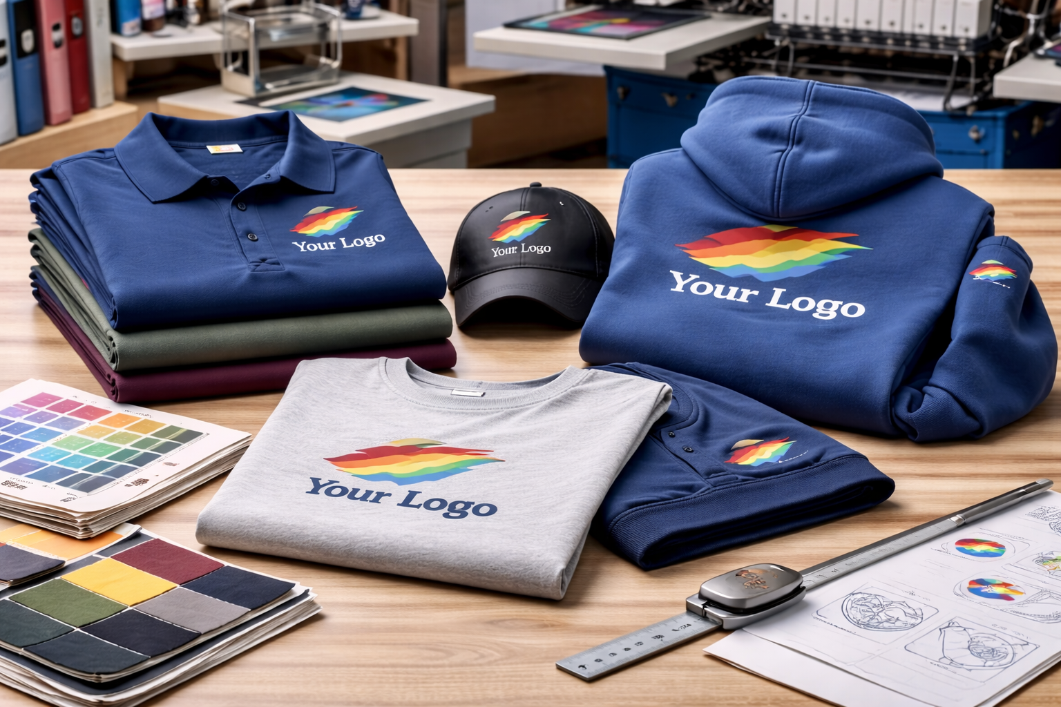
When it comes to custom apparel, most people focus on color, garment style, or decoration method. But one detail that quietly makes a huge difference is logo placement.
Where your logo sits on a garment affects comfort, visibility, brand perception, and even how often the apparel gets worn. Small placement decisions can completely change the final result.
Here’s why logo placement matters — and how to choose wisely.
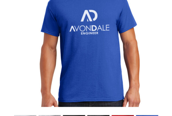
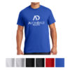
Left Chest: Clean and Professional
The left chest placement is one of the most popular options for a reason.
It feels:
-
Subtle
-
Polished
-
Corporate-ready
This placement works especially well for:
-
Employee uniforms
-
Polos and jackets
-
Long-term daily wear
Because it’s understated, people are more likely to wear these items regularly — even outside of work. This is especially true when you are aiming for custom apparel your team will actually wear instead of something that feels overly promotional.
Full Front: High Visibility
A centered front logo creates maximum impact.
It’s often ideal for:
-
Events
-
Fundraisers
-
School spirit wear
-
Brand launches
However, larger prints can feel less versatile for everyday wear. The bigger the graphic, the more “promotional” the garment may feel. That distinction becomes clearer when comparing retail apparel vs promotional apparel.
Back Prints: Great for Groups and Visibility
Back prints shine in situations where visibility matters:
-
Large teams
-
Outdoor events
-
Trade shows
-
Staff working in public spaces
They’re excellent for recognition from a distance, especially when paired with a subtle front logo. In those cases, color contrast matters too, so it is worth thinking about how to choose the right colors for custom apparel and promotional products.
Sleeve and Shoulder Placement: Modern and Subtle
Sleeve prints or embroidery offer a contemporary feel.
These placements:
-
Feel unique
-
Work well for minimalist branding
-
Add subtle detail without overwhelming the garment
They’re especially popular with brands that want a more retail-style aesthetic.
Size Is Just as Important as Placement
A logo that’s too large can overpower the garment.
A logo that’s too small may lose visibility.
Finding the right balance depends on:
-
Garment size
-
Fabric type
-
Decoration method
-
Intended use
Professional printers typically recommend standard sizing ranges to ensure consistency and proportion. The decoration method matters here too, so it helps to review how to choose between screen printing, embroidery, and other decoration methods before finalizing placement.
Comfort Considerations
Placement affects how a garment feels.
For example:
-
Thick front prints may reduce flexibility on lightweight shirts
-
Large back prints can add weight
-
Certain placements feel better for embroidery than printing
Matching placement to decoration method improves wearability.
Brand Perception and Intent
Logo placement sends a message.
-
Large and bold = energetic, promotional, event-driven
-
Small and subtle = premium, professional, wearable
There’s no “right” choice — only the right choice for your goal.
How to Decide What Works Best
Before choosing placement, ask:
-
Who will wear this?
-
How often?
-
In what setting?
-
What impression should it leave?
Clear answers make placement decisions much easier.
Final Thoughts
Logo placement may seem like a small detail, but it shapes how apparel looks, feels, and gets worn. Thoughtful placement improves comfort, strengthens branding, and increases the chances your apparel becomes part of someone’s routine — not just a one-time item.
When design and placement work together, your logo does more than show — it represents.