Color is the first thing anyone notices about a custom shirt — before the logo, before the design, before the fabric. The right combination of garment color and ink makes your brand jump off the shirt; the wrong one buries a great logo so it barely reads across the room. The good news is that getting it right isn’t guesswork. A few simple rules will steer you toward apparel that actually makes your brand pop.
Here’s how we help customers choose colors that work.
The Short Version
Prioritize contrast between your design and the garment, build around your real brand colors, and keep the palette tight. Light designs on dark shirts and dark designs on light shirts almost always win. Match ink to your brand where it counts, remember that the shirt color changes how ink looks, and don’t forget the garment color has to be something people will actually want to wear.
Rule One: Contrast Is Everything
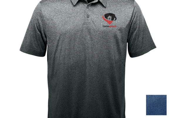
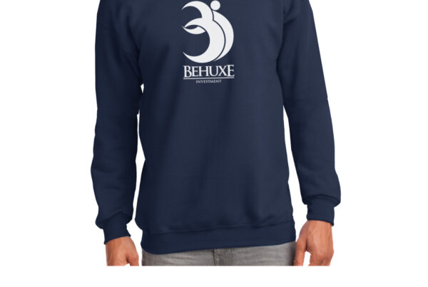
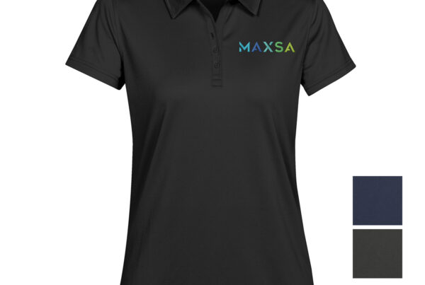
If you remember nothing else, remember contrast. A navy logo on a black shirt disappears; the same logo in white or a bright accent leaps off the fabric. As a rule, put light designs on dark garments and dark designs on light ones. When your brand color is close in tone to the shirt (a red logo on a maroon tee, say), add an outline or a contrasting element so the design still reads from a distance. Contrast is what makes a logo legible — and legibility is the whole point.
Choosing the Garment Color
The shirt color sets the tone before the ink even lands. A few things to weigh:
- Brand fit — your team colors or a neutral (black, white, gray, navy) that plays well with your logo.
- Versatility — neutrals go with any ink color and suit almost any setting; bold garment colors make a statement but limit your ink choices.
- Practicality — darker colors hide stains (great for kitchens and outdoor work), while lighter colors keep you cooler and show off full-color prints.
- How many to offer — one or two colors keeps an order simple and consistent; a few options let people pick a favorite, which boosts how often they wear it.
Matching Ink to Your Brand
For a logo, ink color usually means matching your brand palette as closely as the process allows — and screen printing can hit specific Pantone colors for a consistent, recognizable look. Keep the number of ink colors reasonable: a clean one-to-three-color design almost always looks sharper (and prints more affordably) than a busy full-color one. One important thing many people miss — the garment color underneath shifts how ink reads, especially lighter inks on dark shirts, which is why we often add an underbase or nudge a shade to keep your color true. The decoration method matters here too, since embroidery, screen printing, and DTF each reproduce color differently; our guide on choosing a decoration method covers the differences.
Don’t Forget the Fabric
The same ink color can look slightly different on a smooth cotton tee versus a heathered blend or a performance poly, because the fabric’s texture and base tone affect how color sits on it. If exact color matters, it’s worth choosing garment and ink together rather than in isolation. Our guide on choosing the right fabric explains how material affects the final look — color included.
Color, Design, and Whether People Will Wear It
Color choices don’t live in a vacuum — they work together with your design and placement, and they influence whether people actually put the shirt on. A color that feels loud or off-brand ends up in a drawer; a tasteful, wearable one gets worn constantly. Think about your audience and the vibe you want, and pair your color decisions with a clean design and smart placement — see our guides on designing a shirt people want to wear, where to put your logo, and choosing apparel your team will actually wear.
Final Thoughts
Great apparel color comes down to a few reliable moves: lead with contrast, build around your brand, keep the palette tight, and choose garment and ink together with the fabric and method in mind. Nail those, and your logo pops, your brand reads clearly from across the room, and people are happy to wear it.
Not sure which colors will make your brand shine? Get in touch — we’ll help you choose garment and ink colors that make your logo look its best.