You’ve picked the garment, settled on a decoration method, and finalized your artwork — then comes a question that trips up more orders than you’d expect: where does the logo actually go? Placement seems like a small detail, but it’s the difference between apparel that looks professionally made and apparel that looks slightly off. A logo that’s too high, too big, or in an unexpected spot draws the wrong kind of attention.
Here’s how we think about decoration placement in the shop, and how to choose the right spot for what you’re making.
The Short Version
For most business apparel, a left-chest logo is the safe, professional default. Go full-front when you want the design to be the star — events, retail, spirit wear. Use the back for big statements and team identity, and treat sleeves, collars, and hems as accents, not main events. When in doubt, smaller and higher reads as more polished than big and centered.
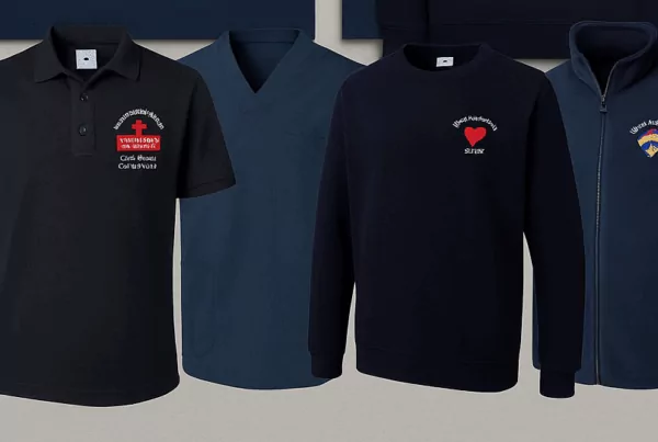
Left Chest: The Professional Default
The left-chest logo is the workhorse of branded apparel for a reason. It’s understated, it reads as “uniform” rather than “merch,” and it works on polos, button-downs, tees, jackets, and fleece alike. Standard sizing is roughly 3–4 inches wide, positioned about 7–9 inches down from the shoulder seam and aligned with the wearer’s left. This is the go-to for staff uniforms, corporate wear, and anything where you want the brand present but not shouting. If your apparel is headed into a workplace, our guide on choosing the right apparel for different work environments pairs well with this decision.
Full Front and Center Chest: Maximum Impact
When the design is the point — event shirts, fundraisers, retail drops, team and spirit wear — the full-front or center-chest placement gives it room to breathe. Typical print width runs 10–12 inches, centered horizontally and starting a few inches below the collar. This is where bold graphics, slogans, and large logos belong. It’s also the placement most people picture when they think “custom T-shirt,” so it’s the natural choice when you want the apparel itself to be memorable rather than just branded.
Backs, Sleeves, and Small Accents
The rest of the garment opens up once you’ve handled the front:
- Full back — the biggest canvas you have. Perfect for team names, large logos, event details, or a sponsor list. Common on the upper back (yoke) or centered for a full statement.
- Sleeves — a clean spot for a secondary mark, a year, a number, or a sponsor logo without cluttering the front.
- Collar / nape — a small logo at the back neck reads as a premium, retail-style touch.
- Hem and pocket — subtle accents for a more designed, fashion-forward look.
Combining a left-chest front with a full-back design is one of the most popular layouts we run — understated from the front, bold from behind.
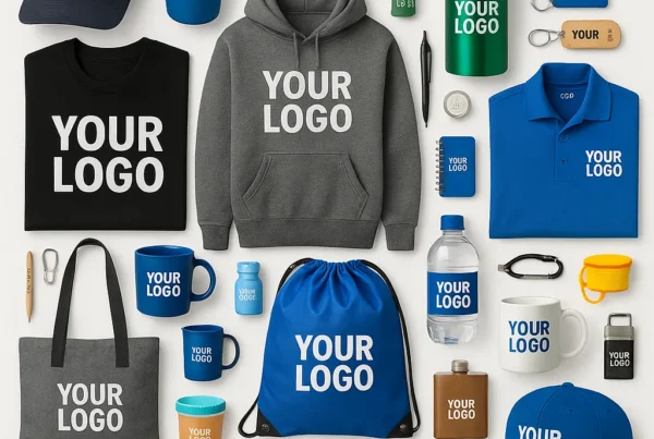
Hats, Bags, and Non-Apparel Items
Placement rules change once you leave shirts. On caps, the design centers on the front panel and the structure of the hat dictates how big you can go — we cover this in detail in our buyer’s guide to custom embroidered hats. On bags, totes, and drinkware, you’re usually working with a single flat imprint area, so simpler, centered artwork tends to win. The common thread: let the item’s shape guide the placement rather than forcing a shirt layout onto everything.
How Placement Affects Method and Cost
Placement isn’t just visual — it has real production consequences. Each print location is a separate setup, so a front-and-back design costs more than a front-only one. Some spots also favor certain methods: embroidery is ideal for left-chest logos and caps, while large full-front or photographic designs lean toward screen printing or DTF. If you’re still choosing how to decorate, start with our overview of screen printing, embroidery, and other decoration methods. And when you request a quote, telling us the exact placements up front gets you an accurate price the first time — our rundown of what information you need before requesting a quote covers the rest of the details that matter.
Final Thoughts
Placement is one of those small decisions that quietly determines whether your apparel looks intentional or improvised. Left chest for professional and understated, full front for impact, back for big statements, and accents where they add polish — match the spot to the purpose and the garment, and you’ll rarely go wrong. (Keep in mind that good placement only lasts if the garment is cared for properly; see how to care for custom printed and embroidered apparel to keep prints sharp.)
Not sure where your logo should land? Get in touch and we’ll help you map out placements that fit your garments, your brand, and your budget before we ever hit the press.